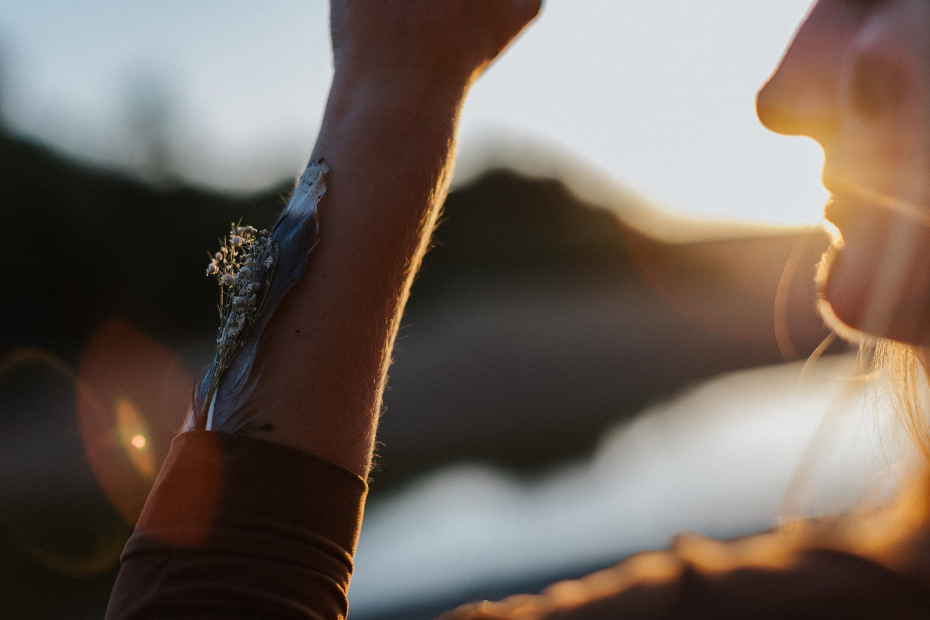
White text on a pale background. Her email was almost impossible to read, especially outdoors on a phone. Same footer, same brand, and now the email is the first thing you see.
BeforeAfter
Bridal makeup
2026
Migration
Web design
Copywriting
Two languages
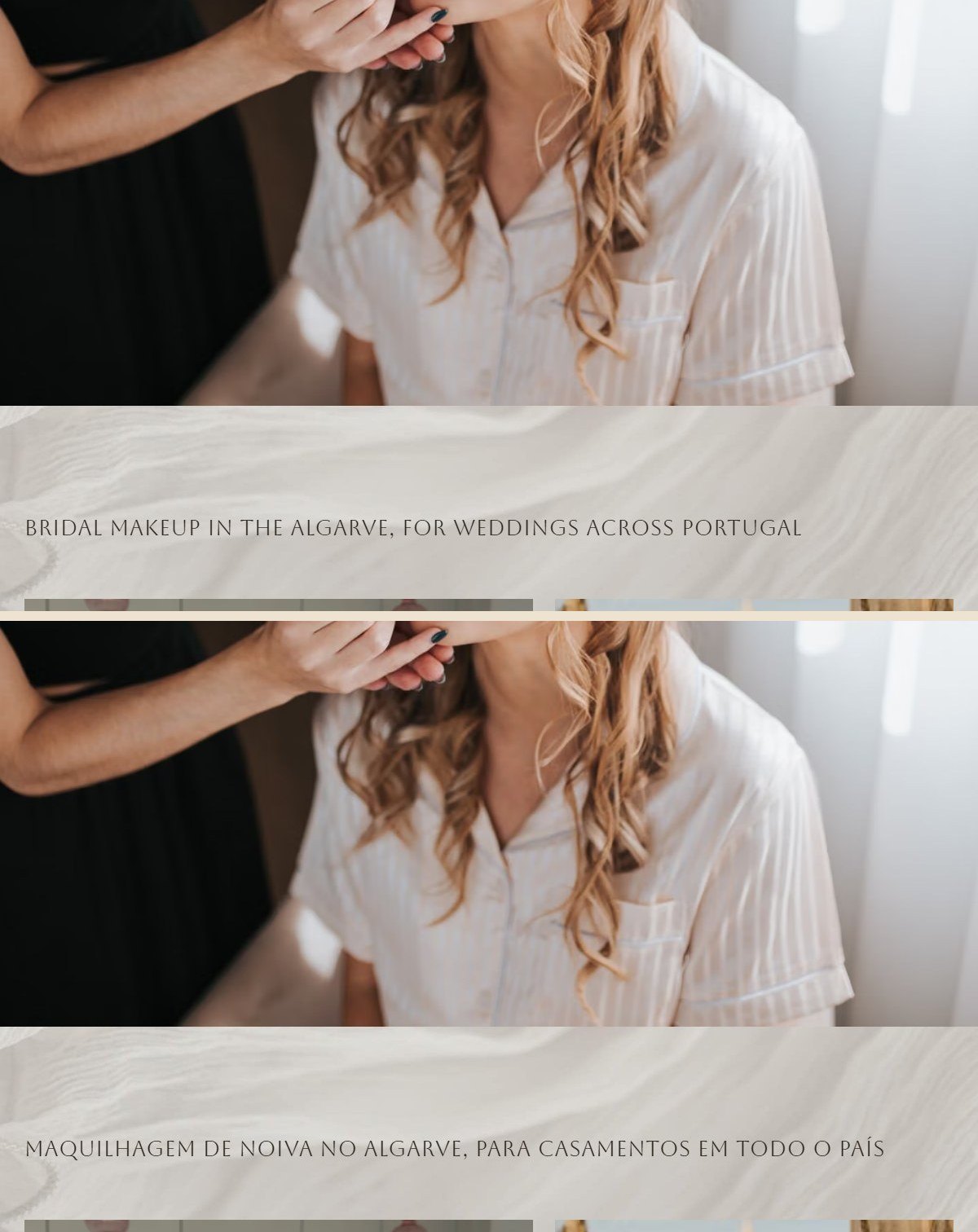
Bárbara is a bridal makeup artist in the Algarve, and she asked for a site brides could actually find. Her old site looked lovely, but Google could barely read it and every change went through someone else. Now it speaks English and Portuguese, brides find it, and she edits it herself.

A bridal makeup site moved off Wix, now loading almost instantly in two languages, and hers to edit.
"The website now loads almost instantly. It no longer feels like a DIY website, and I feel much more confident sending potential clients there."
Bárbara Santos

Bárbara is a bridal makeup artist in the Algarve. Her old site looked lovely, but Google could barely read it and every change went through someone else. Now it speaks English and Portuguese, brides find it, and she edits it herself.
Her brand already worked and brides already found her. So the photos, the words and every web address stayed, and links saved years ago still open the right page.
Ten of the fourteen pages had no clear title for Google, and 380 of the 460 photos had no description. Now every page and every photo says what it is, in both languages.
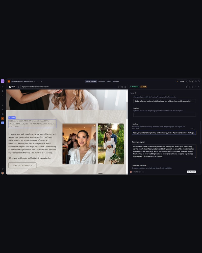
Bárbara isn't technical and has nobody to call when something won't publish. She clicks the text on her own page, changes it, and it goes live straight away.
The old site loaded seventeen different fonts. The new one keeps the three that carry her brand, so pages open faster and read calmer.
Wix sent phones a separate site. Now one layout fits every screen, and on a phone the galleries keep two photos per row, so a portrait never fills the whole screen.
The opening curtain became part of her brand on every screen. It now takes 2.6 seconds instead of 4.5, and plays once per visit.

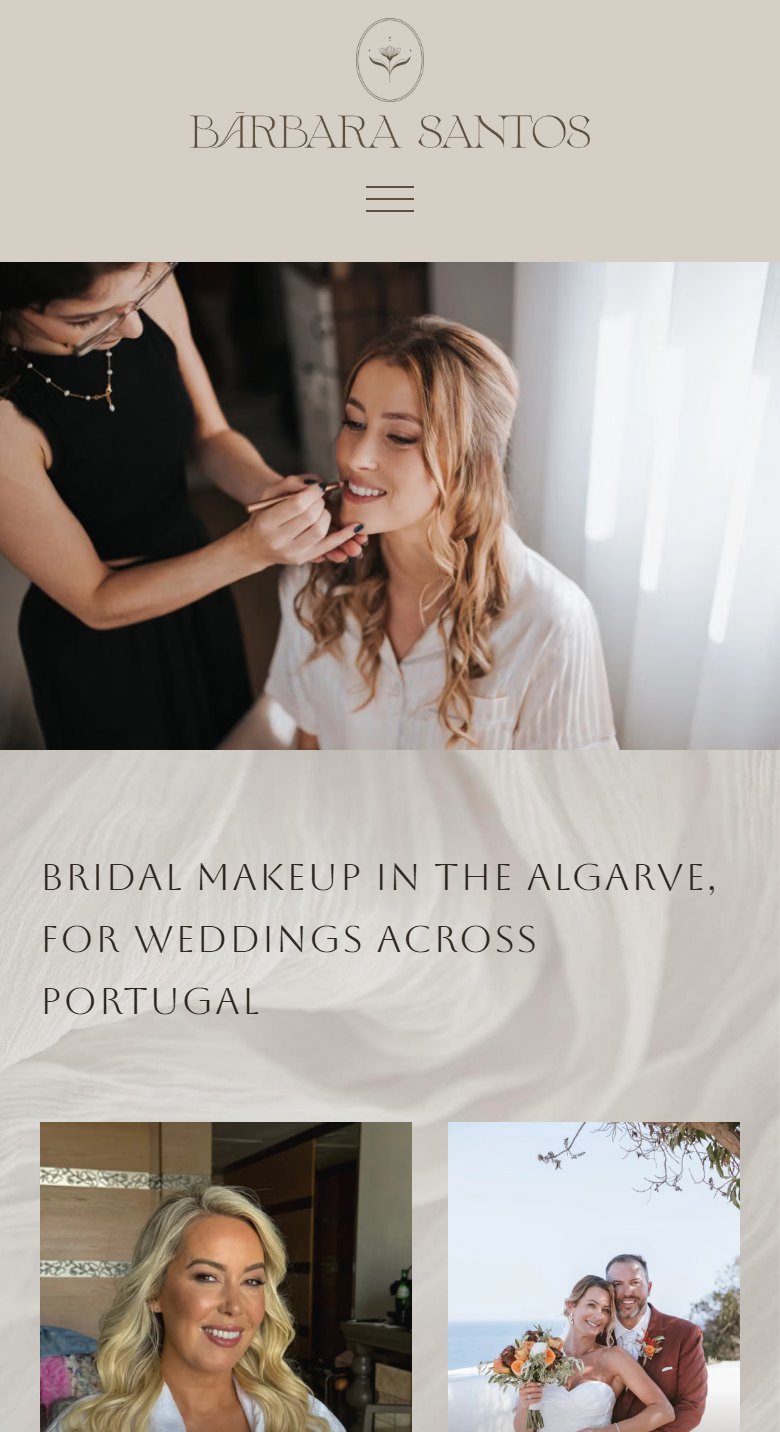
1. The first screenWho she is and where she works, in her words.

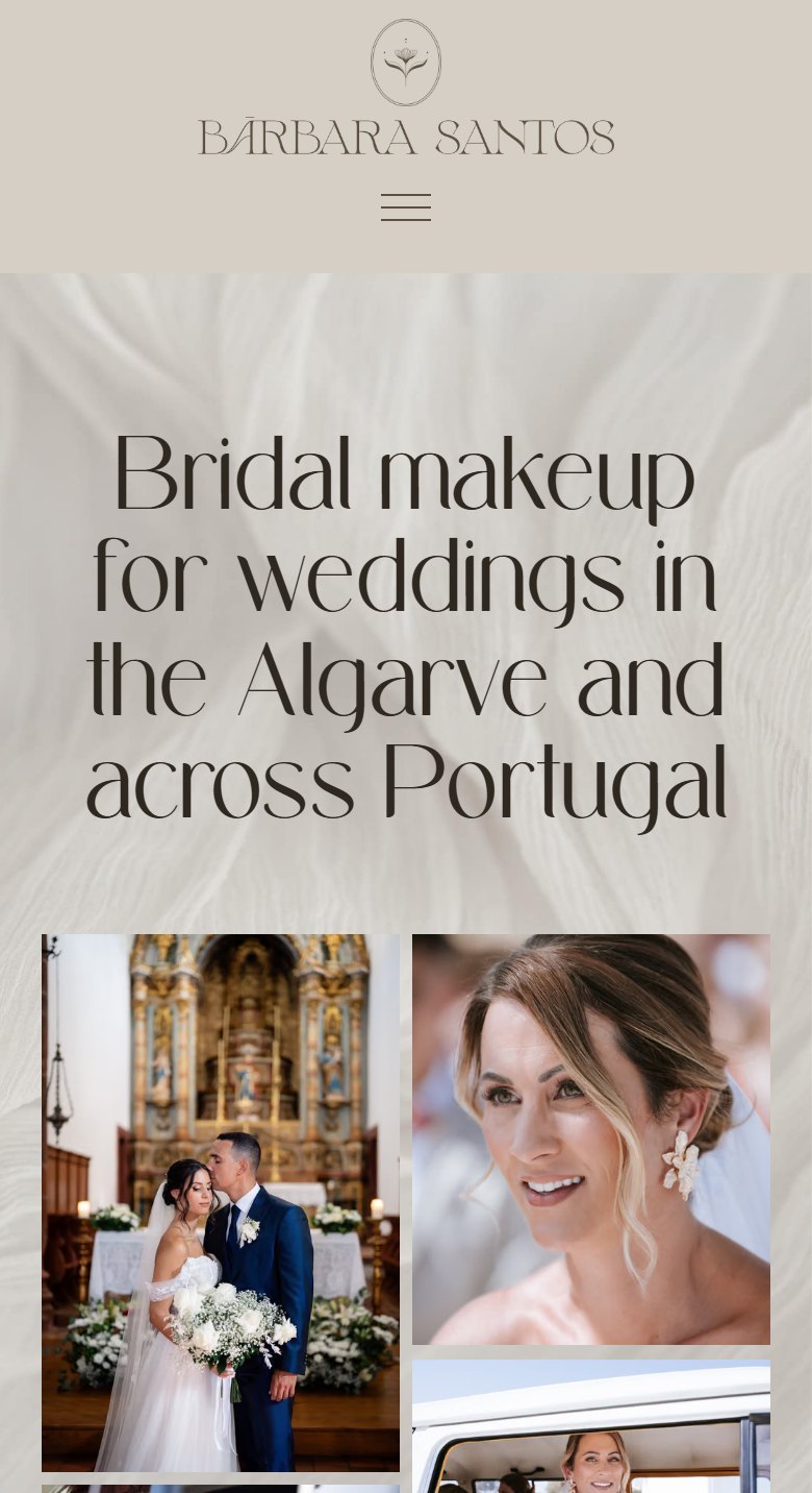
2. The bridal pagePhotos first, two per row on a phone.

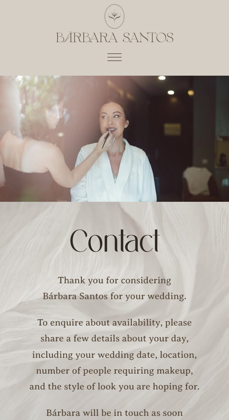
3. The enquiry formDate, service and places, checked before it is sent.
From the outside, almost nothing changed. These are the small things a bride notices without knowing why.
White text on a pale background. Her email was almost impossible to read, especially outdoors on a phone. Same footer, same brand, and now the email is the first thing you see.
BeforeAfter
The dropdown covered the page behind it, and a flag stood in for “English”. Now the menu opens cleanly and the language switch says EN and PT.
BeforeAfter
Same section, same photo. “Enquire Now” became “Check availability”, to match a brand that never pushes.
BeforeAfter
Old site → new site
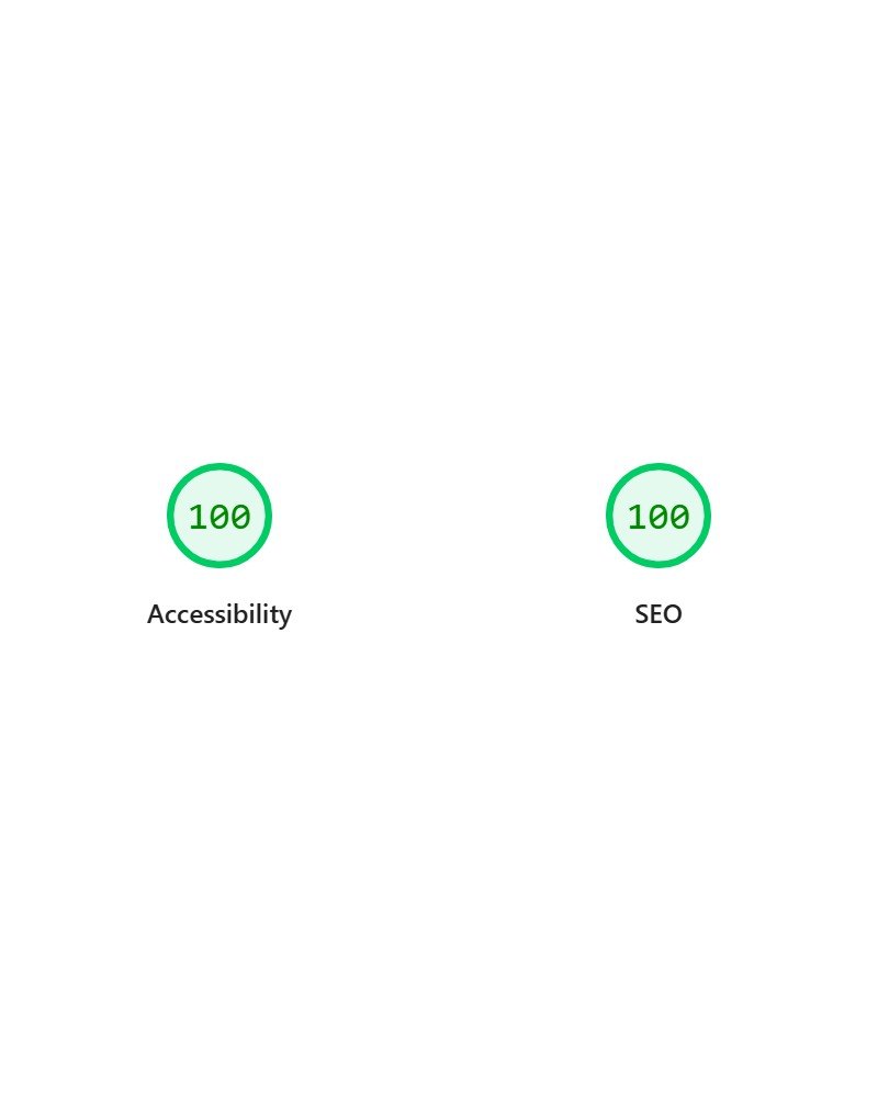
Measured with Google's own check (Lighthouse), on the live site. 100 is the top score in each one.
Also new: an enquiry form that asks for what she needs, and answers to the questions brides ask most.
I originally built my website myself on Wix, but over time I started running into two main problems: the cost was increasing significantly, while the website itself wasn't performing as well as I needed it to.
My website is very image-heavy because I'm a makeup artist and my portfolio is a huge part of how potential clients get to know my work. Unfortunately, the website was taking too long to load, especially the images, and I realised that people could leave within just a few seconds without even seeing what I had to offer.
At the same time, Wix was becoming much more expensive for me, which made me question whether I was getting the right value for what I was paying. That's when I started looking for another solution and reached out to you.
You completely rebuilt the website using coding and AI, while also creating a much more practical interface where I can easily manage and update my own text and images.
The biggest difference for me was the speed. The website now loads almost instantly, and everything feels much smoother and more responsive. My images, which are such an important part of my business, are actually being seen rather than taking several seconds to appear.
You also looked at the website from a business and user-experience perspective, not just from a technical one. You pointed out things that could be improved in terms of layout, readability and design, and made adjustments that I probably wouldn't have thought of myself.
I now have a website that feels much more professional and reflects the quality of my work much better. It no longer feels like a DIY website, and I feel much more confident sending potential clients there.
Most importantly, people can now see my work and what I offer almost immediately, instead of potentially losing interest while waiting for the website or images to load.
I also feel that the new website gives potential clients a much clearer and easier experience when deciding whether I'm the right makeup artist for them. I'm really happy with how it turned out, and I feel like it's a much better foundation for attracting new enquiries and growing my business.
Scan the code with your phone and the chat opens, already addressed to me.