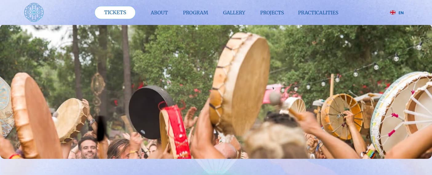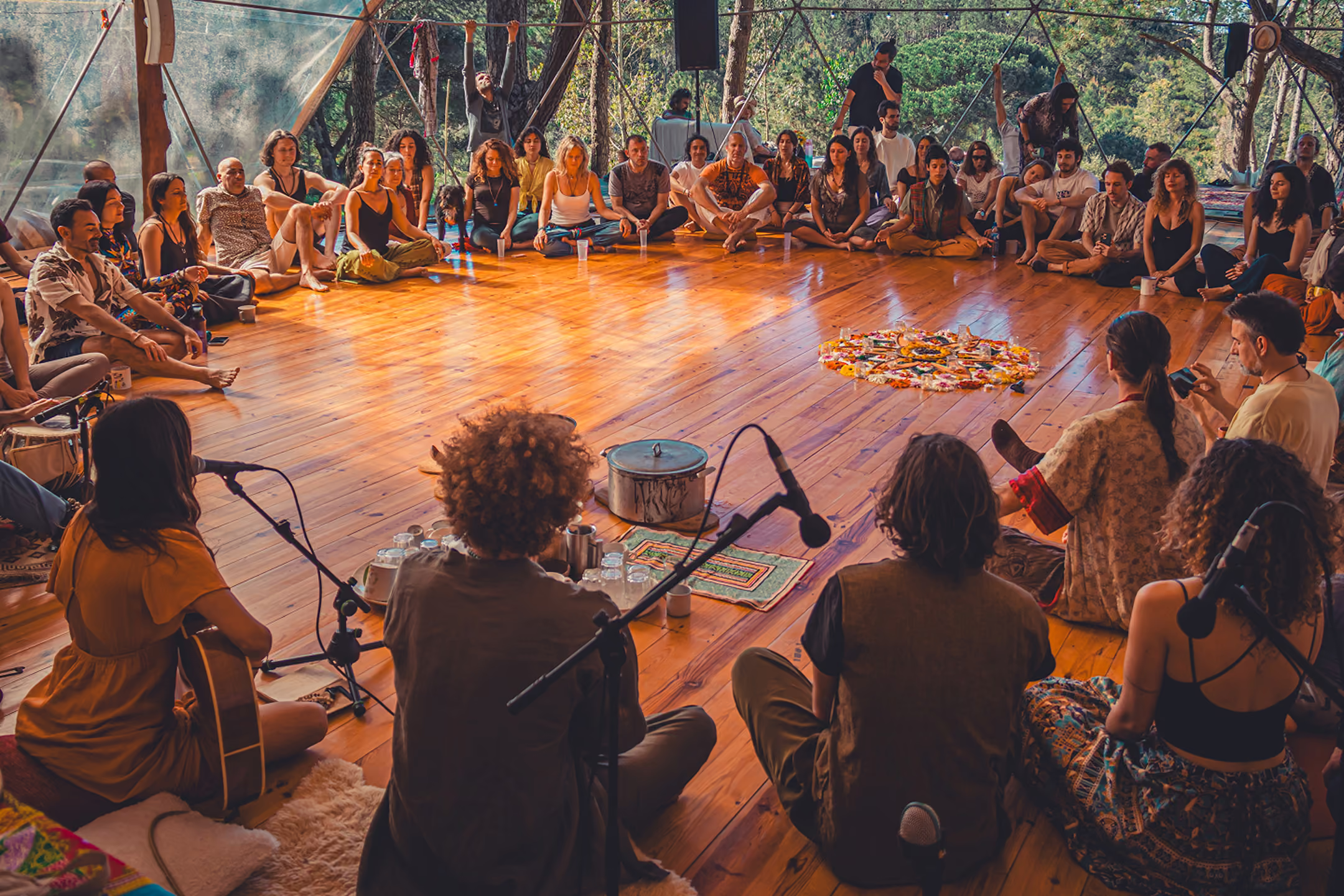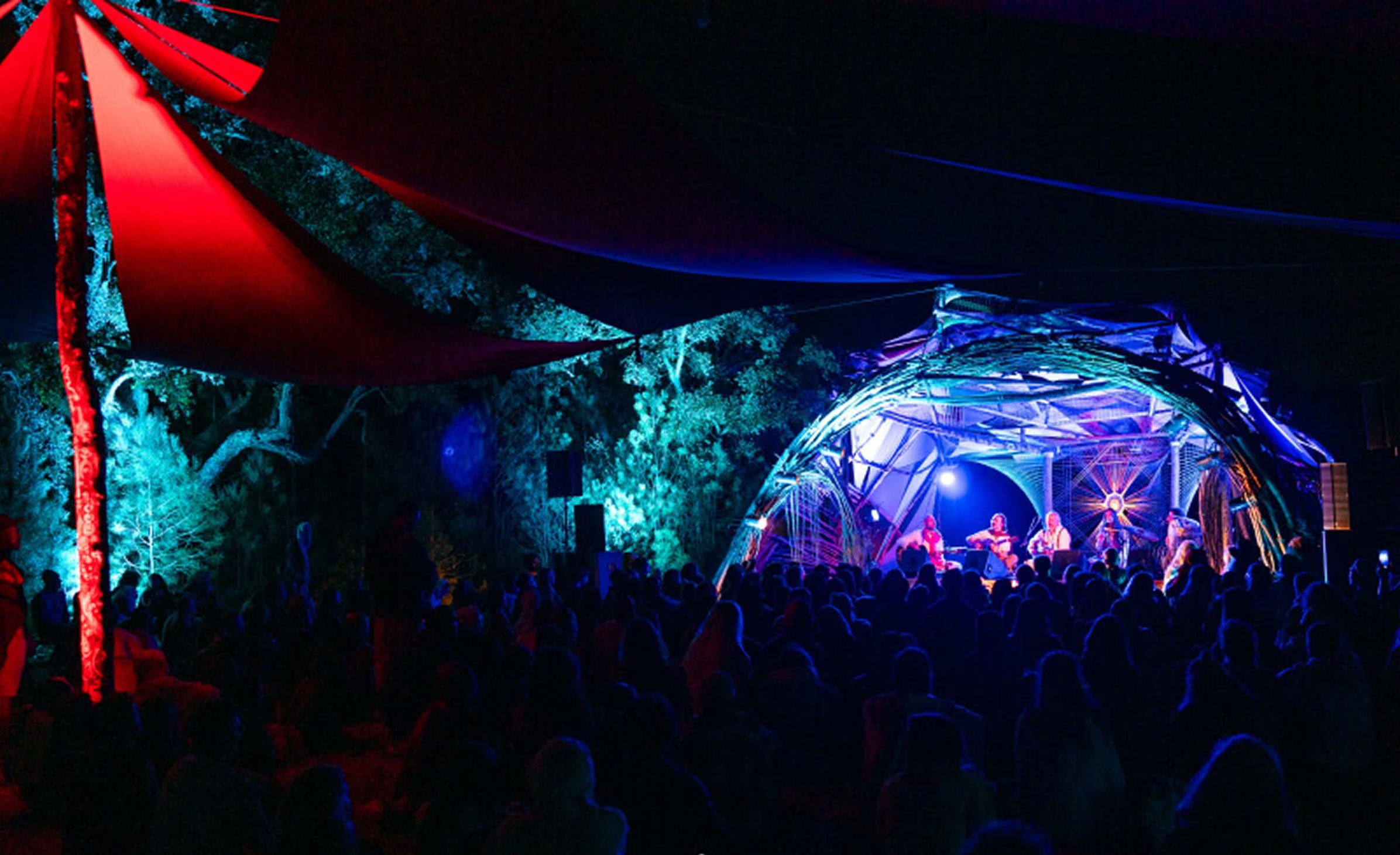
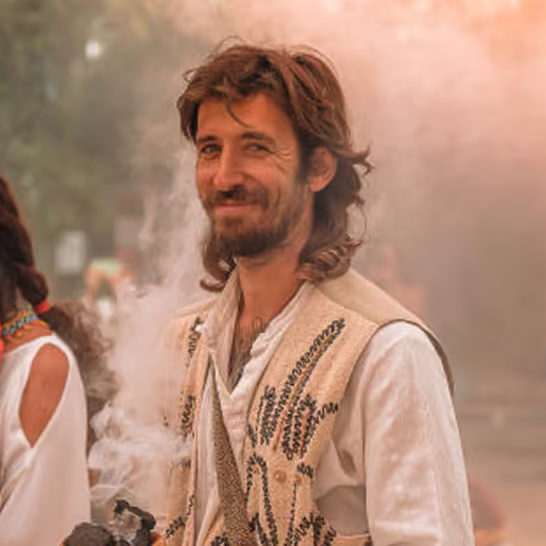
Before, the first screen was the dates in a heading and a small photo. Now it's a full video of the people who come, with the tickets right there.
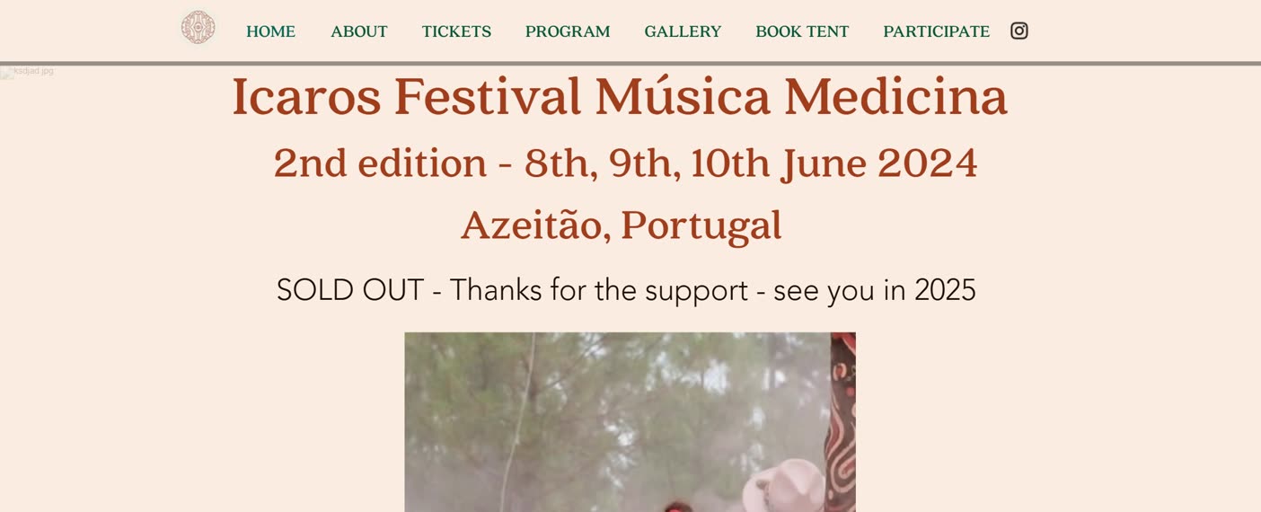
BeforeAfter
Music Festival
Poster & Logo: Ada Abromaitytė
Tickets: Rui
(Espiga Studio)
Redesign
Migration
Motion
Ongoing care
Icaros had outgrown its Wix site and asked for one that could hold the whole festival, because artists, stages, editions and programmes were all separate and every change was a job. I rebuilt it so the festival's world fits together, and the atmosphere of the poster carries through every page.

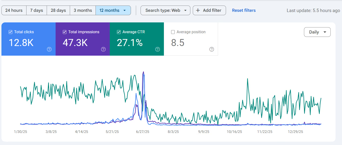
A festival that had outgrown Wix, now found by 12,800 people a year on Google and run by its own team.
"He made a fantastic job working for our Icaros Medicine Festival and we highly recommend his work."
Tomás Mello BreynerIcaros had outgrown its Wix site. Artists, stages, editions and programmes were all separate, and every change was a job. I rebuilt it so the festival's world fits together, and the atmosphere of the poster carries through every page.

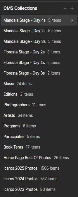
Before anything was drawn, artists, stages, editions and programmes had to know about each other. Open an artist, and you see where and when they play.
More than a thousand artists, photos and pages moved across from Wix, each one already prepared and in its place.
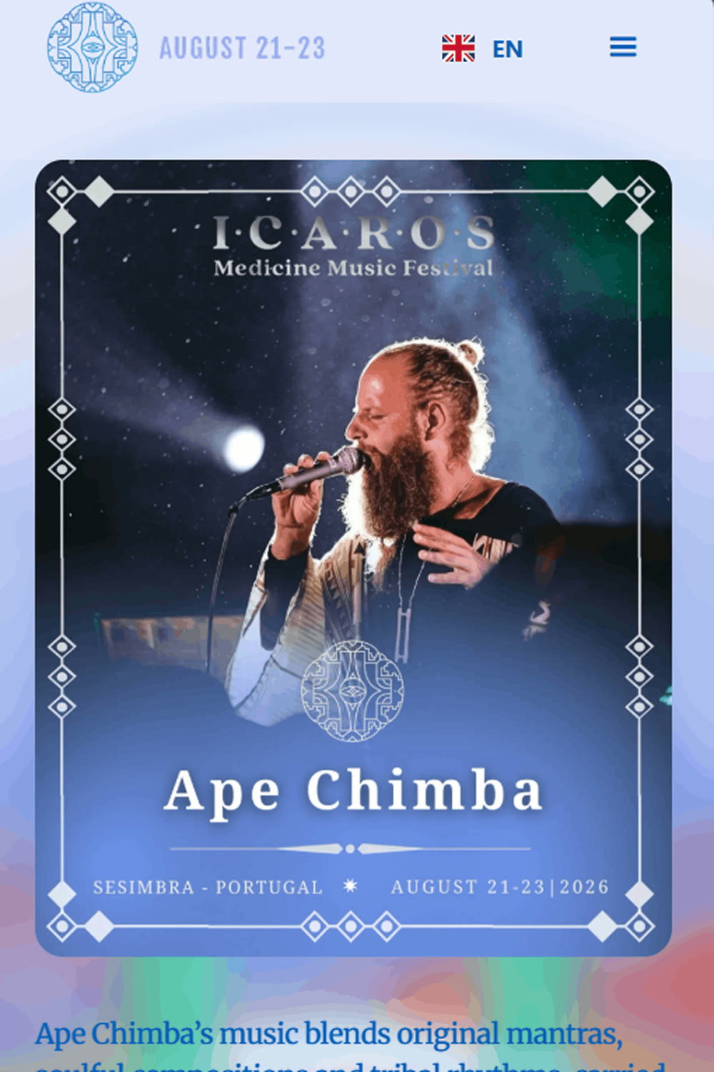
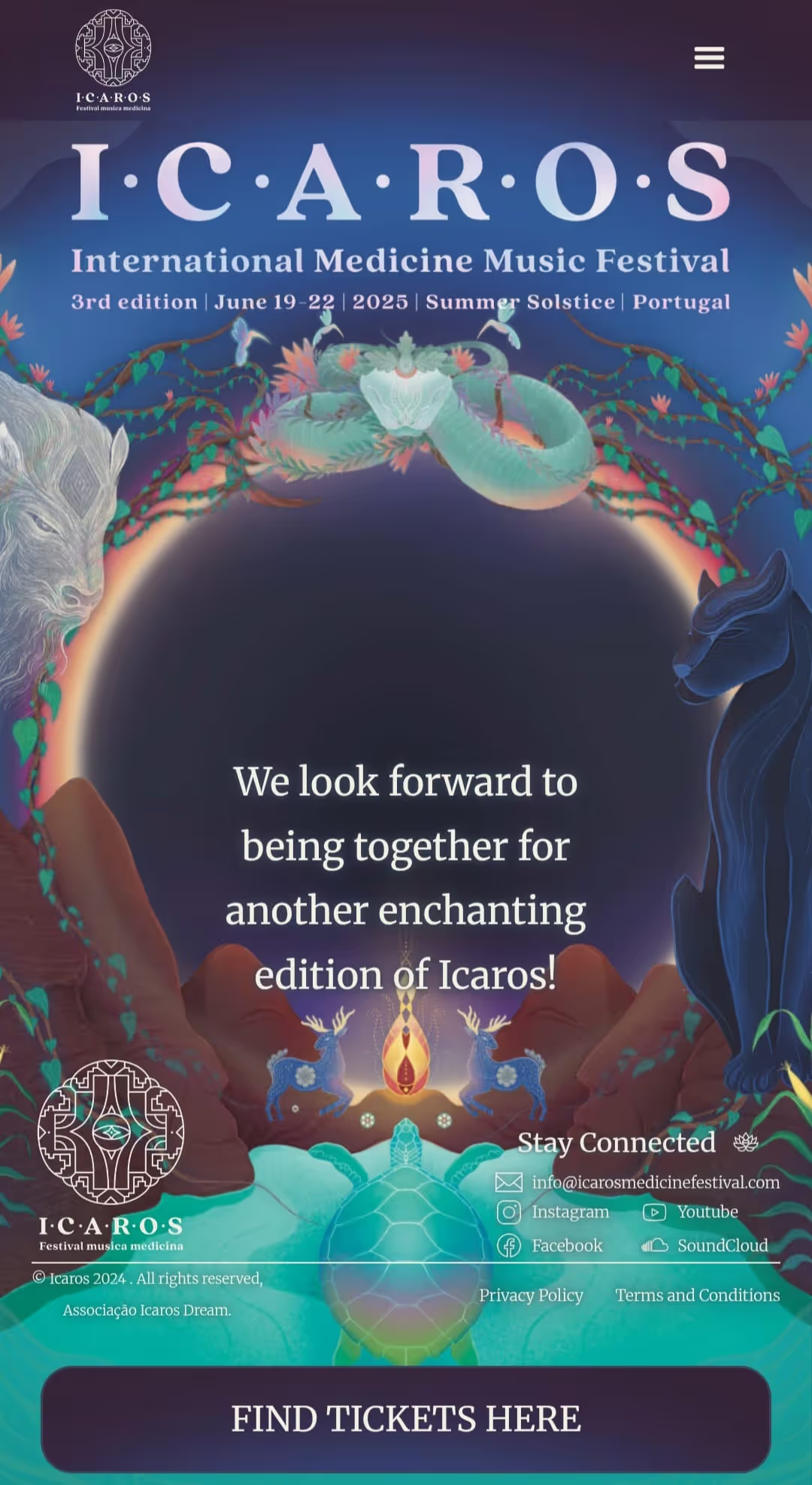
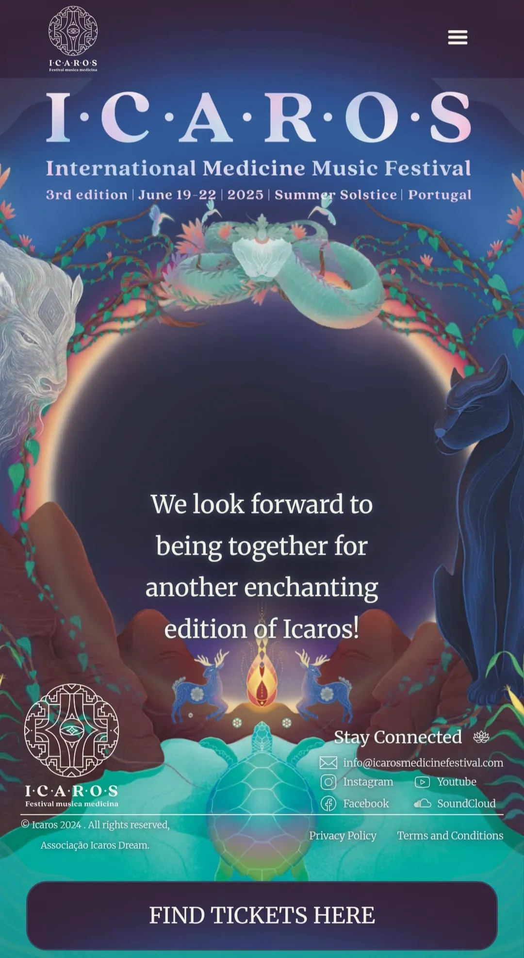
The poster has more than twenty layers moving on a phone, and the site still opens quickly.
It opens with a full video, becomes the layered poster, then lets you in. The pacing feels like arriving at the festival.
The poster and the brand came from another artist, Ada Abromaitytė. My job was carrying that energy across every page, so each one feels like the same world.
The poster's layers move as you scroll, as part of the experience.

1. The poster, aliveThis edition's artwork opens the site, with the tickets one tap away.

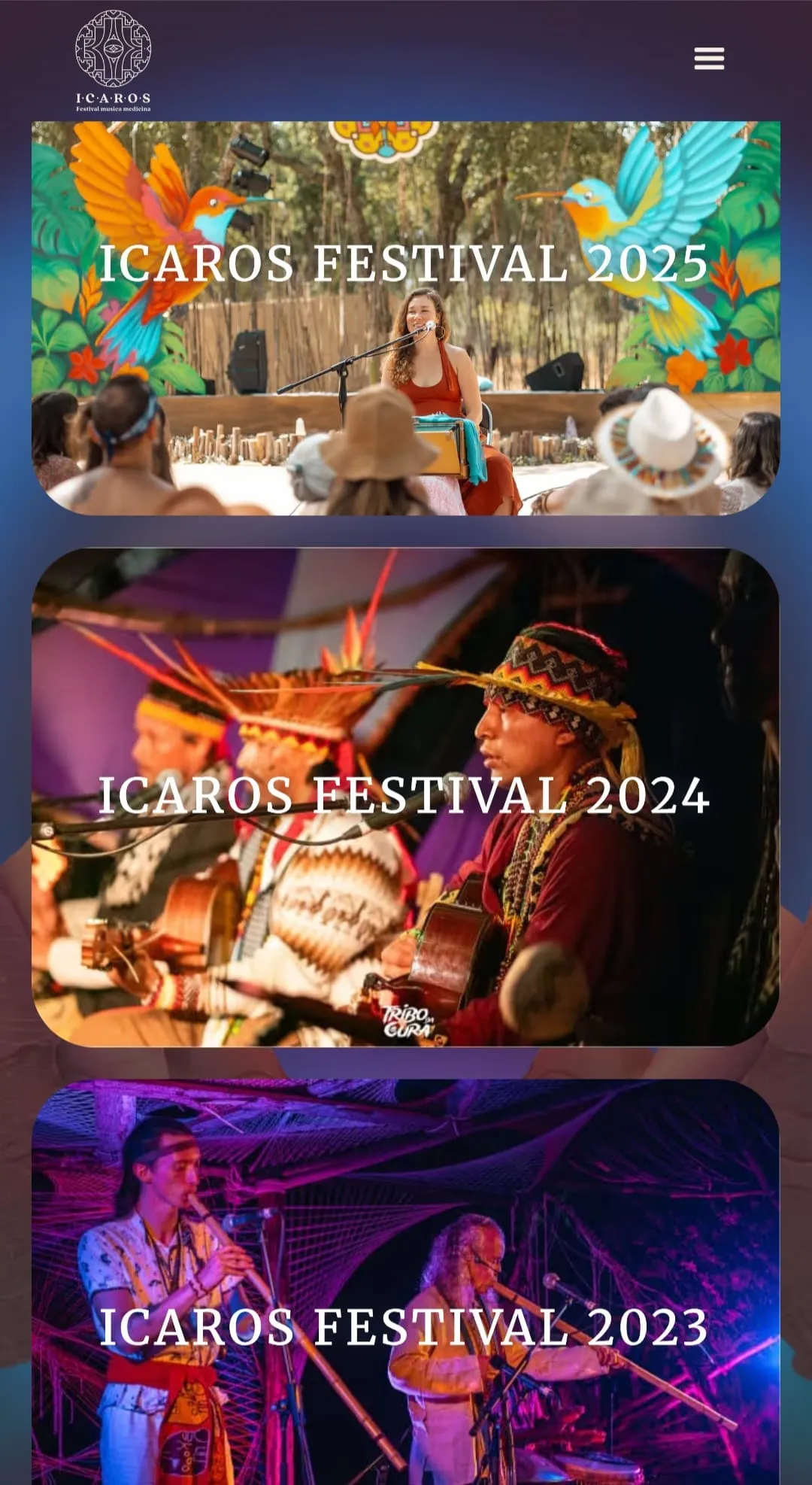
2. Every edition kept2023, 2024 and 2025, each with its own gallery.

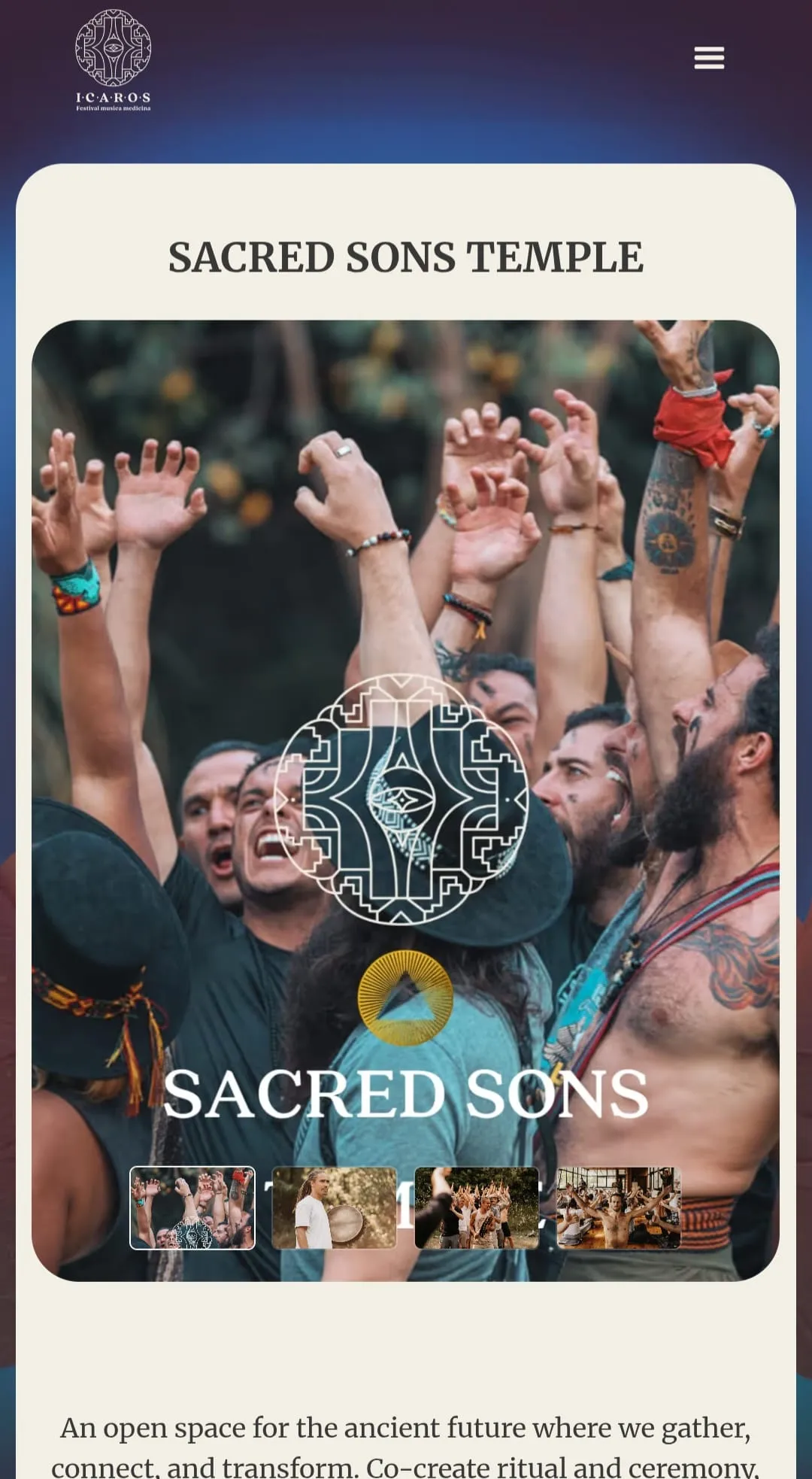
3. Room to growNew projects like Sacred Sons get their own space.
Same festival, same artists. The old site said the essentials in plain text and one poster, and the festival was much bigger than that.
Before, the first screen was the dates in a heading and a small photo. Now it's a full video of the people who come, with the tickets right there.
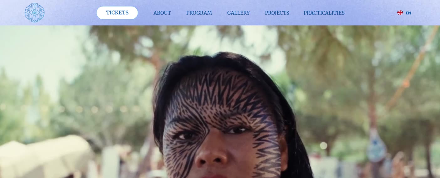
BeforeAfter
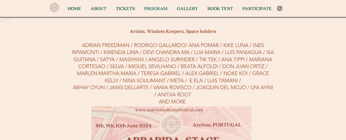
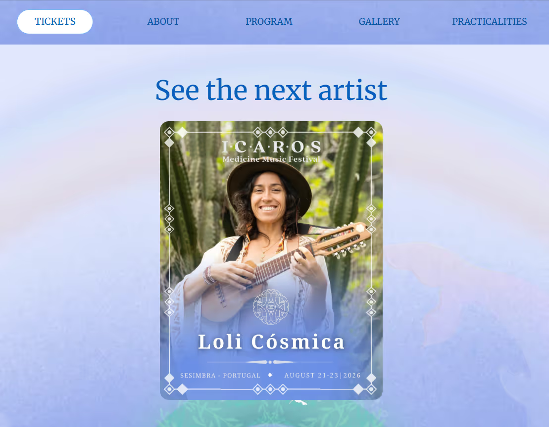
The programme was a wall of names and a flyer saved as an image. Now every artist has a card, a story and their music, and the schedule is text that Google can read.
BeforeAfter
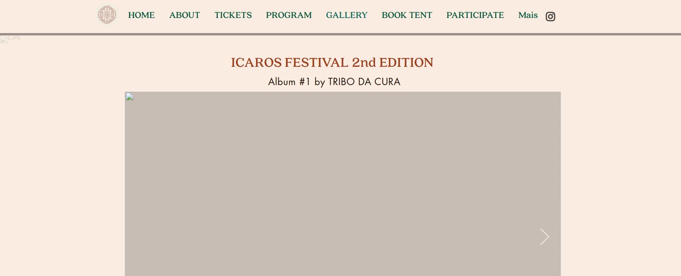
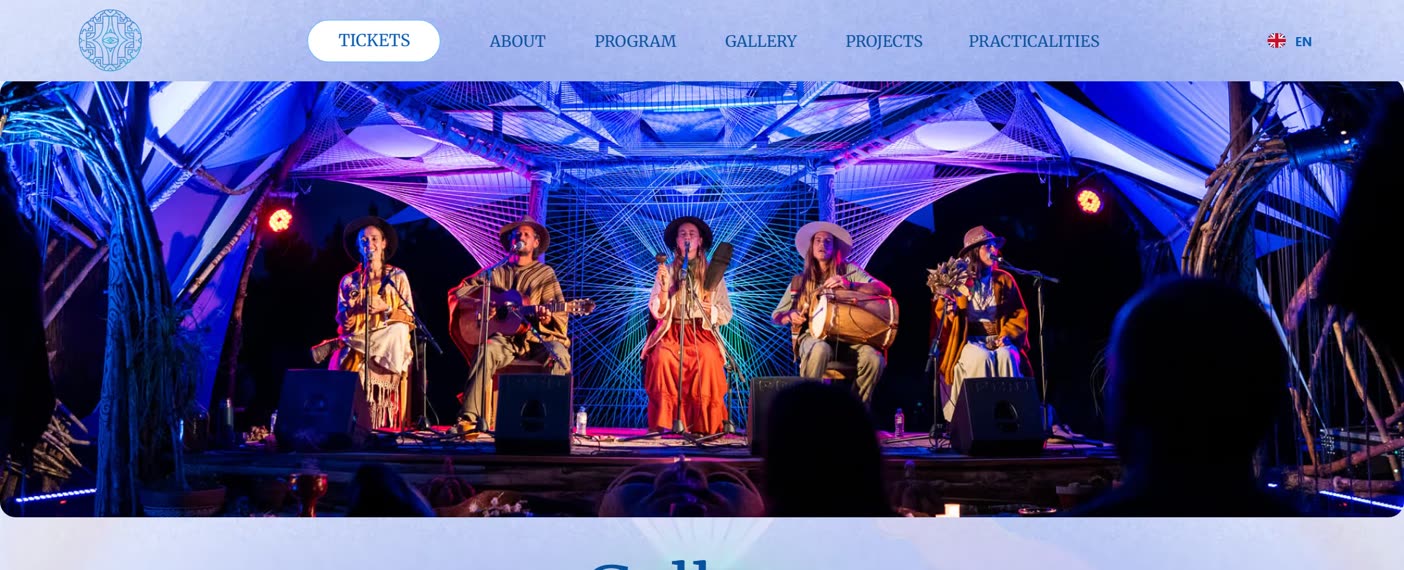
The old album sat as an empty grey frame while it loaded. Now every edition has its own gallery, quick to open at full quality.
BeforeAfter
Also new: a page for the practicalities, a projects page for Sacred Sons, the site in English and Portuguese, and the tickets button at the top of every page.
Scan the code with your phone and the chat opens, already addressed to me.