In short
- The first website I ever made was for Coração de Cacau. This year they came back, and I rebuilt every page in code.
- Two calls and one concept in Momo’s own words, then every page: the gatherings, 5,200 photos, the shop, in English and Portuguese.
- AI proposes three options for every section and I decide, sometimes against its advice, because I know this community from the inside.
Coração de Cacau runs gatherings with ceremonial cacao, ecstatic dance and live music at Vale do Rossim, a lake in the Serra da Estrela, since 2018. Their first website was the first website I ever made. This year they came back, and I rebuilt it from the first screen to the last.
The first website I ever made
I made the first Coração de Cacau website in Webflow in 2023, when I was only starting. I was already dancing at their gatherings, and I learned as I built it. It carried them for two and a half years, with every gathering added by the team.
Then the newsletter pulled them to an all-in-one platform, and the website moved there with it. It made sense for them at the time, and I let it go.
Coming back
This year Momo asked me to bring it home. He came with a clear wish: “the adult version of our website.” Same family, same lake, same cacao. Something more chic and more professional, without losing the warmth that makes people come back every year.
This time the website lives in its own code, so the next tool they choose for emails or tickets plugs into it, and the site stays where it is.
Two calls before any design
The first call was about the brand. I took Momo through my 38 questions about copy and brand strategy: where the business is today, what’s new, the direction he wants to take, and the energy Coração de Cacau should keep. The second call was about the website itself: which pages, which features, the look and feel, and what should happen in the first 5 seconds and in the next 5 minutes.
Three audiences came out of those calls, each with its own page and its own invitation: the people who come to the gatherings, the festivals that book Momo, and the companies that want a day with the team. Almost every important decision on the site traces back to something Momo said in those two calls.
One concept, in Momo’s own words
The concept came from a line he said in the first call:
It’s a journey to arrive. But people tell me after a while: what a gift it was to be here.
Vale do Rossim is far from Lisbon and from Porto. Instead of hiding that, the site tells it: the shared rides, the road into the mountains, the lake at the end. On the homepage, a line draws that road as you scroll, from the city to the lake. It’s the one bold move on the site, and everything else stays calm around it.
Momo also asked for it “less square”, more organic, like “the melting cacao, the heart opening”. So every photo has soft corners, the colours are cacao and cream instead of black and white, and once, between two sections, the cacao melts into the next one.
Why I stopped making wireframes
I used to make wireframes for every project, so the client could read the content before the design. In practice, most clients went straight to “but what will it look like?”. The wireframes took me days, and the client couldn’t feel anything yet, so the energy I put into them didn’t come back.
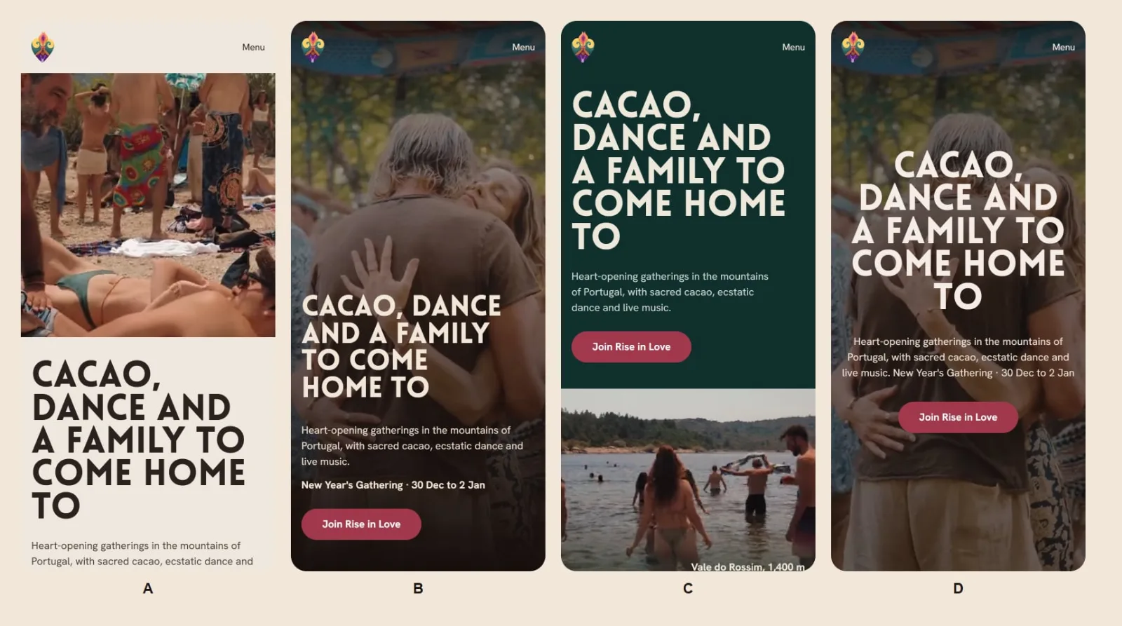
So now I skip them. I show the hero of the homepage in a few directions, with the real text, real photos and real fonts, and the client chooses something he can actually see.
Three options, and saying no to the AI
After the hero, I build every page one section at a time. For each one I ask for three variations and a recommendation. Sometimes I take it. Sometimes I like another one better and ask for three more from that one. Then I look at the new section next to the one before it, on desktop and on the phone, so the page flows.
The text comes from my copywriting agent, written from Momo’s answers. The motion comes from my animation agent, which picks from a library I trust. The photos come from their archive: hundreds of photos per gathering, well organised, so the AI could help me find the right ones for each section.
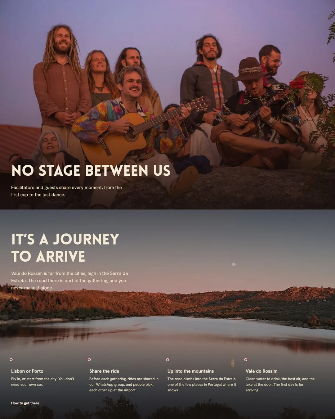
Being part of this community changes the decisions. At one point the recommendation was to avoid two full-width photos in a row: the musicians with no stage between them and the guests, and then the lake. On most sites that’s good advice. Here, those two images are the reason people want to go, and most visitors arrive on a phone, where the two of them tell the story in two scrolls. They stayed.
At the end, a design critic agent went through each page with no context from the build. It found the small things I had stopped seeing: a title in three lines when two read much lighter, spacing that changed from section to section, play buttons in the same colour as the main button. None of them is big. Together, they’re the difference between a page that looks generated and one that feels made.
Every page, not only the homepage
The homepage was where it started, and then came everything else. Rise in Love, at New Year, and Coração Fest, in the summer, share one gathering page: the moments of each day, the artists, where to sleep, how to get there and the tickets, always one tap away. The next gathering is a new entry, and the page builds itself.
Momo has his own page for festival organisers, with the stages he has played. There’s a page for companies, the story of Coração de Cacau, born on a sofa in Lisbon, and a shop that starts with where the cacao comes from before the first price. Every gathering since 2022 has its own gallery, more than 5,200 photos in all, and they still open in a moment on a phone. And all of it is in English and Portuguese.
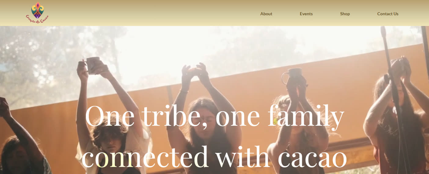
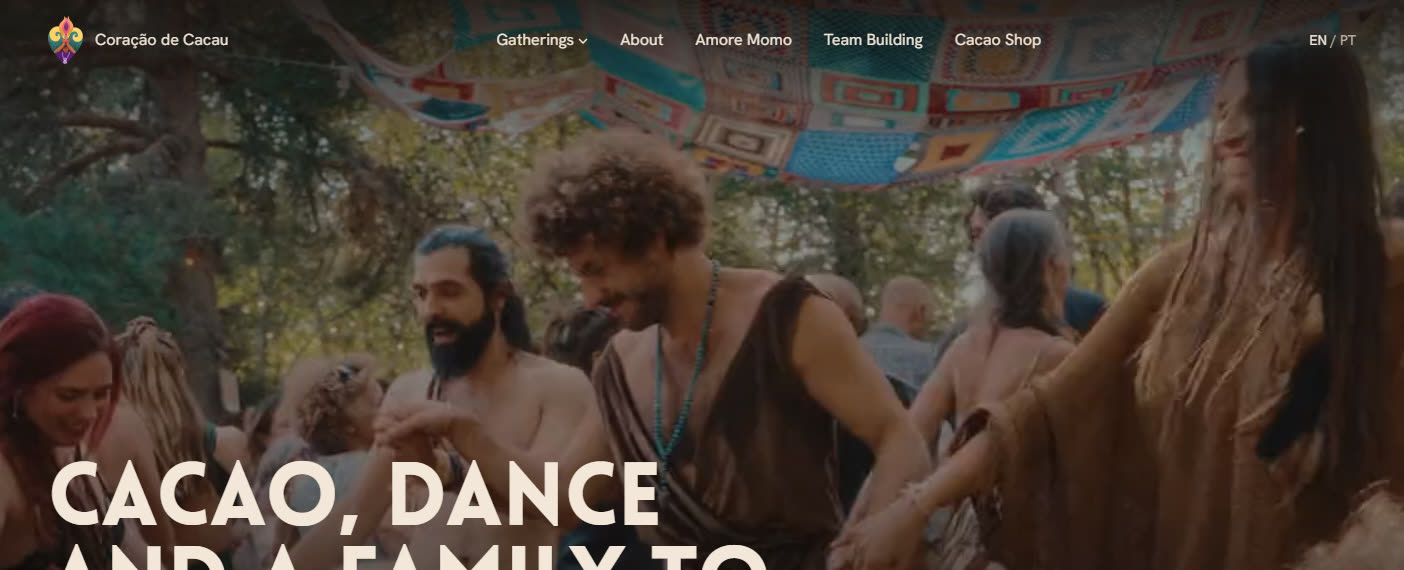 First siteNew site
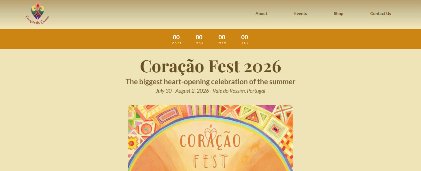
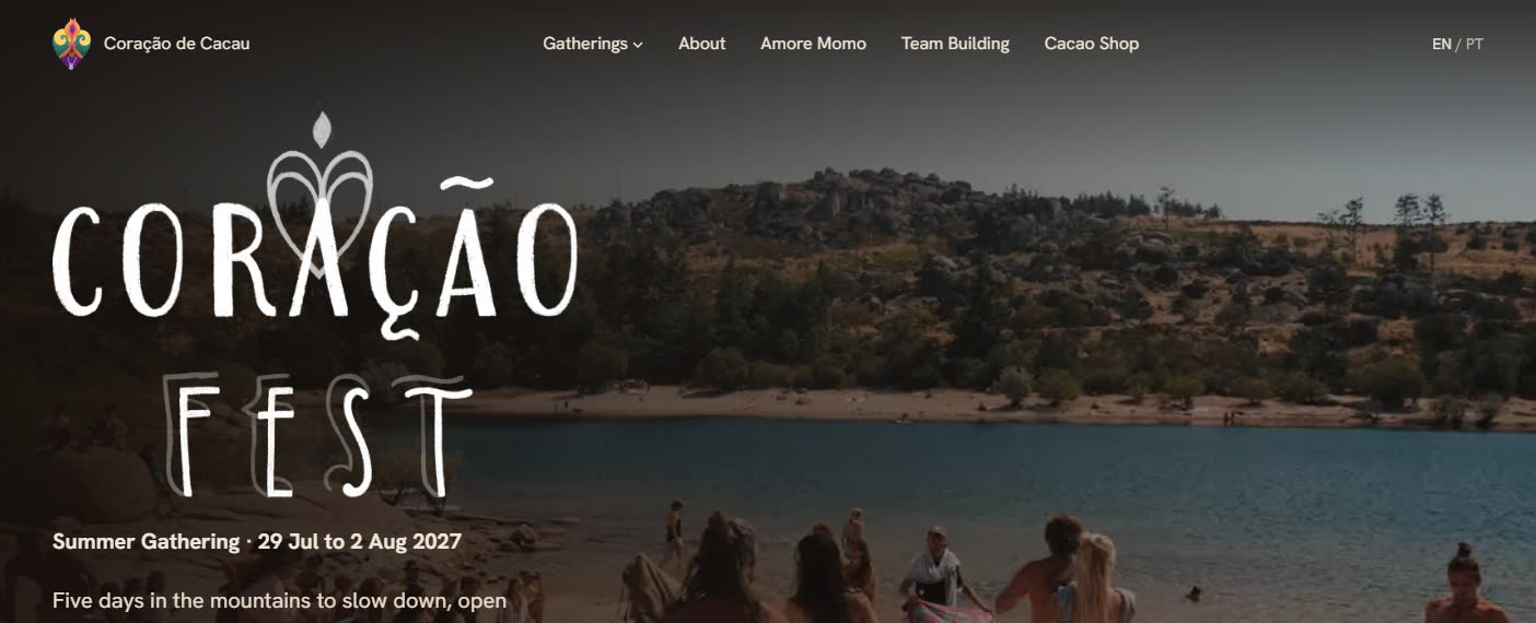 First siteNew site
Momo edits it himself
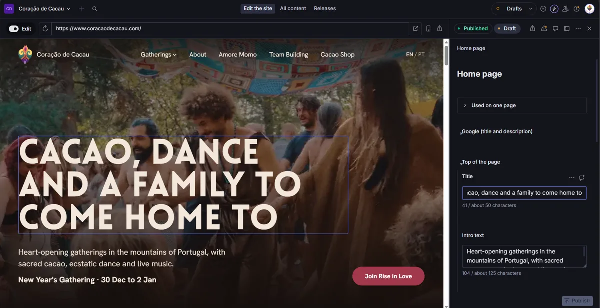
On the first site, Momo already changed things on his own. I didn’t want to take that away. Now every text and every photo can be changed in a visual editor, with the page right beside it, and he sees the change as he types. Gentle warnings instead of errors, when a text runs long or a photo is too small to stay sharp. Publishing puts it live, and the Portuguese version updates on its own.
The rest is the kind of work nobody sees. Every old link, from posts and ads, still opens the right page. Visits are only counted for the ads after someone says yes. And each gathering shows its dates right in Google.
How it was made
I work in Ship Studio with Claude Code, with GitHub and Vercel for the live previews, and Sanity for the editor and the photo galleries. From the first sketch to the live site it took less than three weeks, with other projects running at the same time.
AI made this faster. The two calls, the time spent in that community and the taste to say no stayed human, and they’re what make the site feel like Coração de Cacau.
A full circle
I have danced with them, shared the cacao and sat in the circle. My first website was theirs, and a few years later they trusted me with the new one. So much has changed since then, for them and for me.
It’s a journey to arrive, for the people who go to the lake and for me too.
If your website looks fine but doesn’t feel like being there, let’s talk.
Tell me what you do and where you are stuck. I will answer myself, and you will have nothing to decide yet.